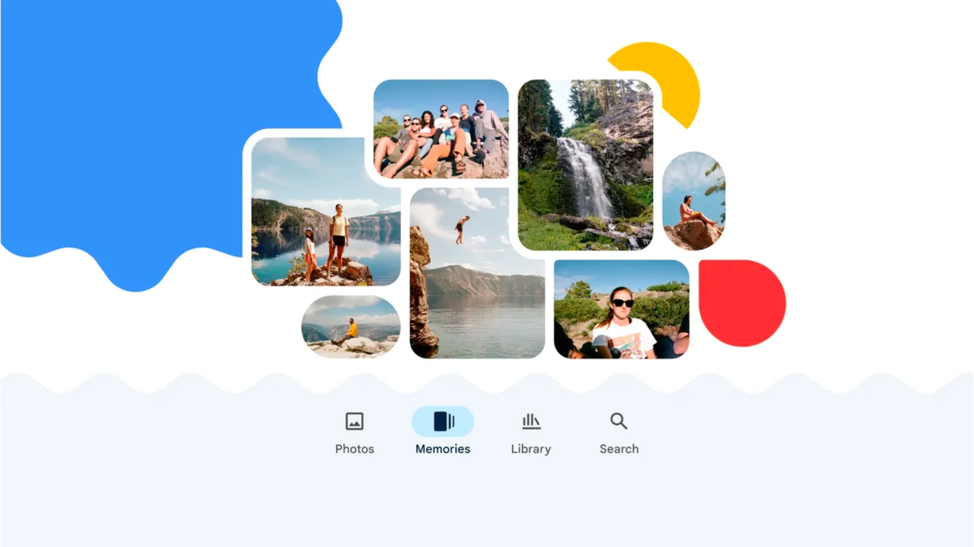
Google Photos is undergoing significant changes with its latest update, focusing on a redesigned ‘Collections’ tab. This move aims to enhance user experience by offering a more streamlined and intuitive interface for managing photos and videos.
Understanding the Redesign
The ‘Collections’ tab replaces the existing ‘Library’ tab, introducing a layout that prioritizes ease of access and reduces visual clutter. The redesign includes neatly organized sections for ‘People & Pets’, ‘On This Device’, and other categories like ‘Albums’, ‘Documents’, and ‘Places’. Each section is visually distinct, making it easier for users to find or categorize their photos and videos. A new feature under this tab is the ability to filter out unwanted clutter such as screenshots, GIFs, and memes, which aims to keep users’ photo libraries clean and relevant.
Mixed Reactions from the User Base
Despite the promising features, the redesign has received mixed reactions from users. Some appreciate the cleaner, more organized interface, while others find the changes cumbersome, especially those accustomed to the previous layout. The adjustment to a new system has been a point of contention, particularly for users who prefer the familiarity and simplicity of the older design.
Implications for Future Updates
The ongoing adjustments to Google Photos suggest that Google is actively seeking to improve user interaction by focusing on automation and organization. These changes are part of a broader effort to make Google Photos not just a storage service, but a dynamic platform for reliving memories and managing digital content efficiently.
As Google continues to refine its features, the feedback from this redesign will likely inform future updates and modifications. Whether this redesign will stand the test of user acceptance remains to be seen. However, it’s clear that Google is committed to evolving its services to better meet the needs of its diverse user base.

