
Nothing Phone (2a) Design
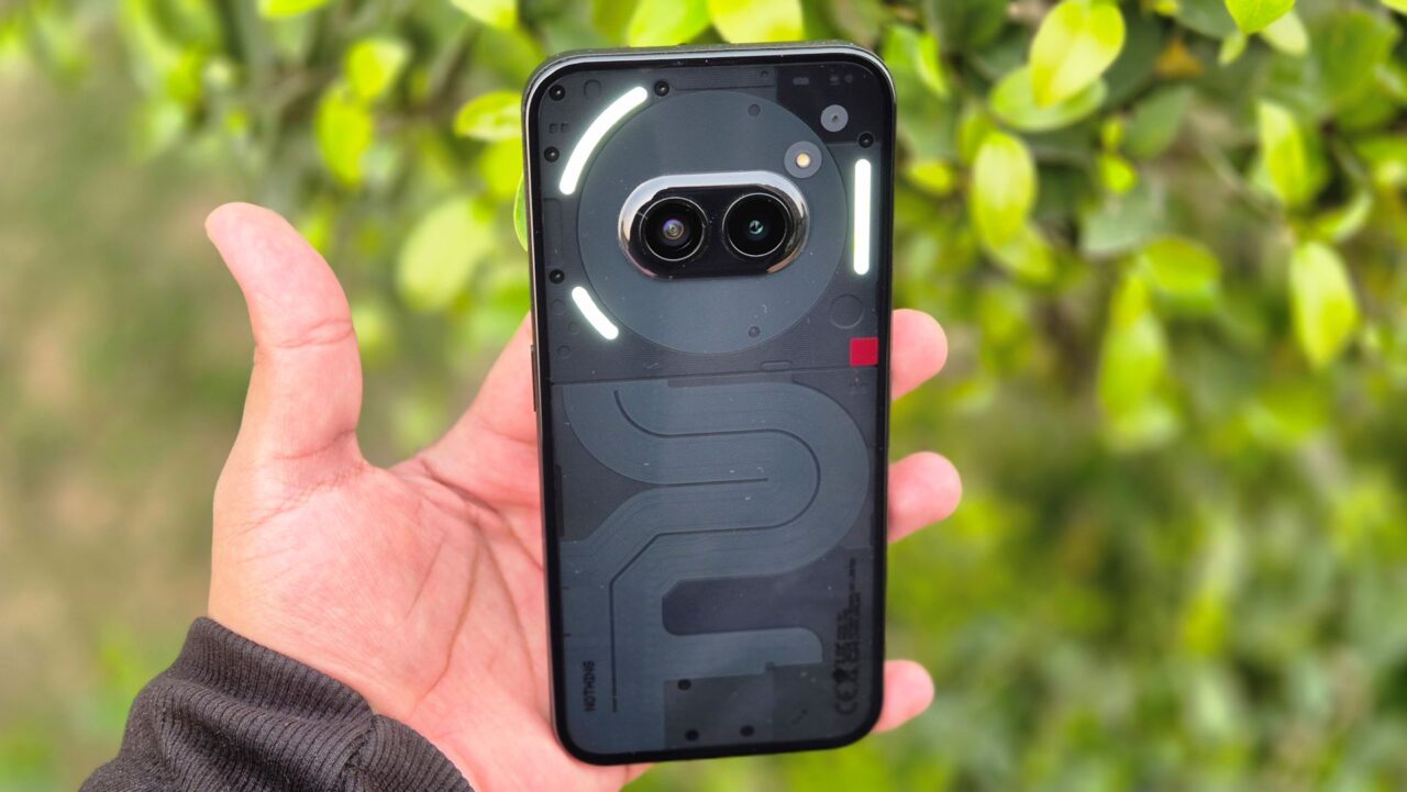
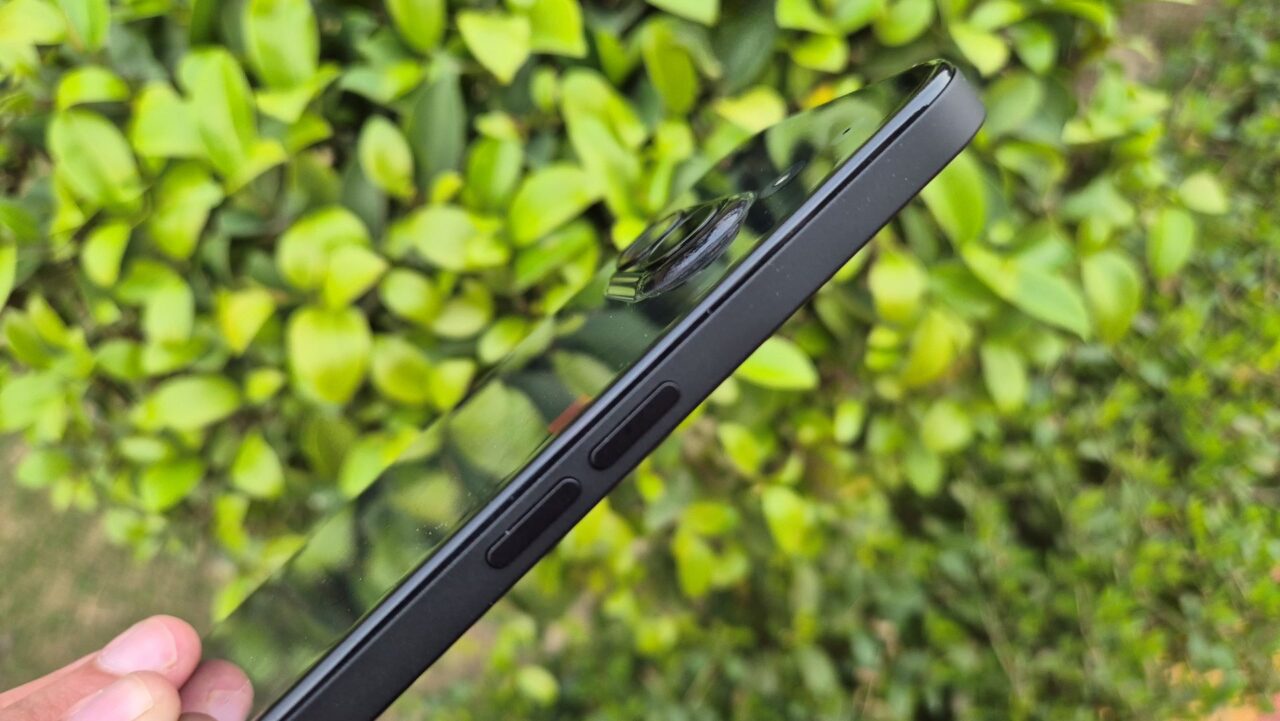
The Phone (2a) ditches the look of its siblings but keeps the Nothing spirit. It’s got the see-through back you love, now with a black, white, and red splash. The front stays similar with a centered camera cutout, but the back curves comfortably like the Phone (2). New camera placement and a small bump adds a unique touch to the whole design and looks. Overall, it’s a stylish phone that looks practical too!
Nothing Phone (2a) Display and Glyph Interface
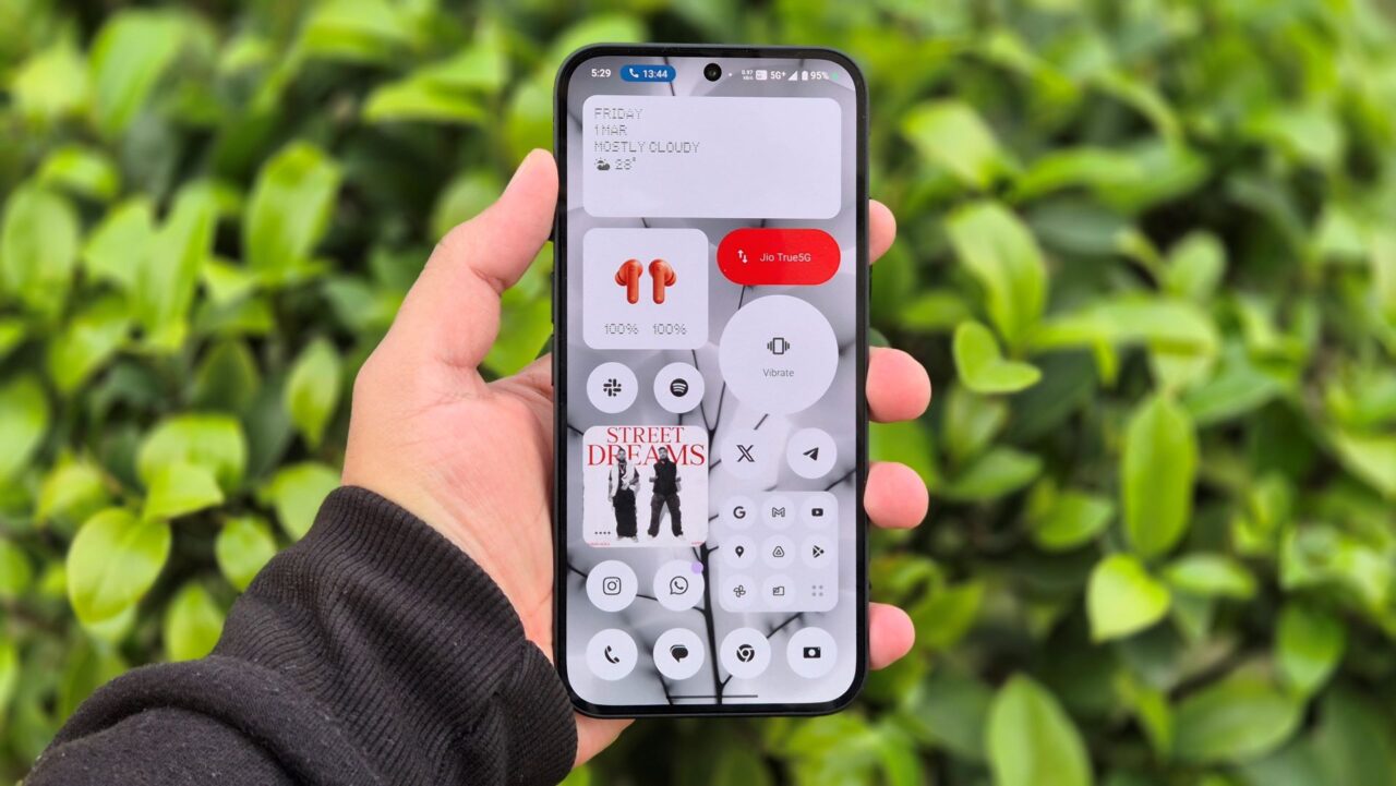
The Phone (2a) is a visual powerhouse. The AMOLED display is beautiful, with deep blacks and vibrant colors. But where it truly shines is the buttery smooth 120Hz refresh rate. Whether you’re scrolling through social media or gaming, everything feels incredibly fluid and responsive. Nothing OS 2.5 keeps things clean and bloatware-free, further enhancing the visual experience.
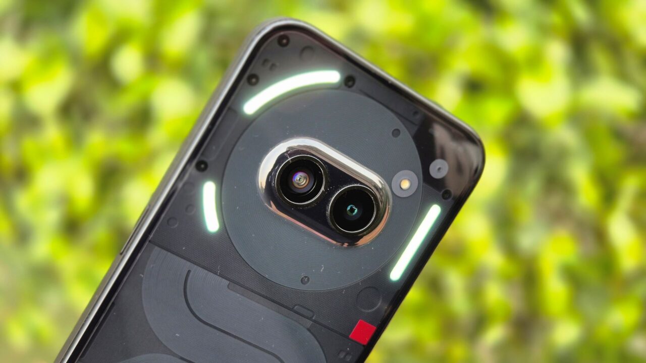
While the Glyph interface has been streamlined to three light strips, it retains its charm. You can still customize it for notifications, and the progressive illumination effect adds a touch of magic. Overall, the Phone (2a) is a joy to look at and use. In my opinion, it sets a new standard for what to expect from a mid-range phone’s display.
Nothing Phone (2a) Camera
The camera on the Nothing Phone (2a) is shaping up to be a real contender, especially considering its price range. Packing dual 50MP sensors for both the main and ultrawide cameras is impressive on paper, and the image quality so far lives up to the hype. Details are sharp, and colors appear natural. What truly excites me, though, is the 32MP front camera. In my experience, mid-range phones often skimp on the selfie experience, but the detailed captures I’ve gotten so far suggest Nothing might be changing the game. I’m eager to delve deeper into the camera app’s features and test it in various lighting conditions.
Nothing Phone (2a) Software and Performance
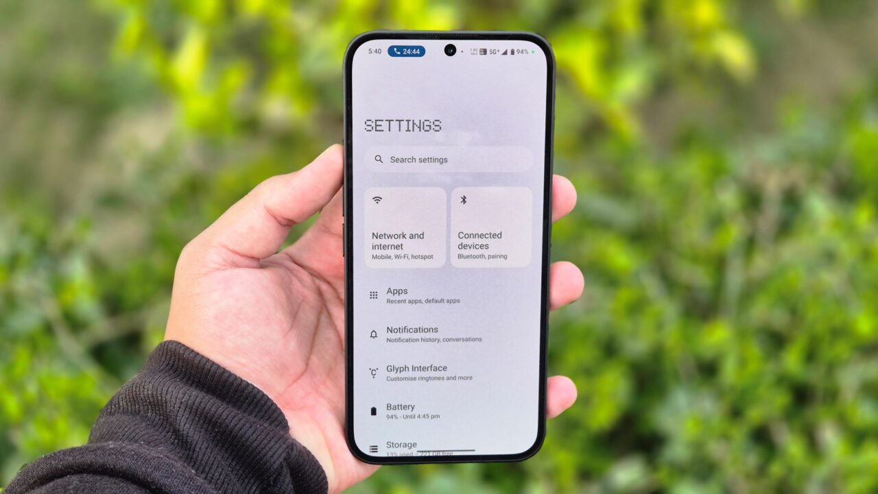
The Nothing Phone (2a) strikes a great balance between a clean user experience and extensive customization. Running Android 14 with Nothing OS 2.5 on top, it’s free of bloatware and gives you a lot of control over the look and feel. Whether you prefer a minimalist monochrome aesthetic or a splash of color with traditional icons, the Phone (2a) lets you personalize it to your taste.
Under the hood, the MediaTek Dimensity 7200 Pro processor is a capable performer. So far, navigating apps and playing games has been smooth and responsive. While I haven’t pushed it to its limits yet, the initial impression is that this phone can handle everyday tasks and some light gaming with ease. I’m interested to see how it performs under heavier workloads, but so far, I’m impressed.
My Opinion & First Impressions

The Nothing Phone (2a) offers a unique and attractive design, high-quality display features, and excellent performance at an affordable price. It stands out with its see-through back design and offers a great camera and smooth software experience. The phone is priced starting at Rs. 23,999 for the basic model, with more storage options available for a little more. This makes it a great choice for people looking for premium features without the high cost. The Phone (2a) proves that you can have a stylish, powerful, and user-friendly phone without spending a lot of money. Wait for our full review which will be coming out soon after we will be done with testing every aspect of the phone.


